Color has the power to transform spaces, evoke emotions, and set the mood for any season. As we embrace the changing tides of fashion and interior design, understanding the latest color trends becomes essential for creating captivating environments. From the runways to living rooms, the strategic use of color can elevate any aesthetic, making it crucial to stay informed about the most inspiring hues of the moment.
Chromatic trends: pantone’s seasonal color forecast
Pantone, the global authority on color, continues to shape the landscape of design with its seasonal color forecasts. These carefully curated palettes serve as a compass for designers, marketers, and consumers alike, guiding the visual direction of countless industries. The latest forecast showcases a blend of vibrant tones and soothing neutrals, reflecting the complex emotions and desires of contemporary society.
Among the standout hues this season are vivid coral, reminiscent of sun-kissed beaches, and deep teal, evoking the mysteries of the ocean depths. These colors not only complement each other but also speak to a collective yearning for connection with nature and escapism. Designers are incorporating these shades into everything from statement furniture pieces to accent walls, creating spaces that feel both invigorating and grounding.
The forecast also highlights the rise of muted pastels, which offer a softer alternative to bold primaries. These understated hues, such as lavender mist and butter cream, provide a versatile backdrop for both minimalist and maximalist design approaches. Their subtle elegance allows for easy integration into existing color schemes, making them a favorite among homeowners looking to refresh their spaces without a complete overhaul.
Psychology of color in fashion and interior design
The impact of color on human psychology is profound, influencing mood, behavior, and even physiological responses. In the realms of fashion and interior design, this knowledge is leveraged to create environments and outfits that resonate on a deeper level with consumers. Understanding the psychological effects of different hues allows designers to craft experiences that go beyond mere aesthetics.
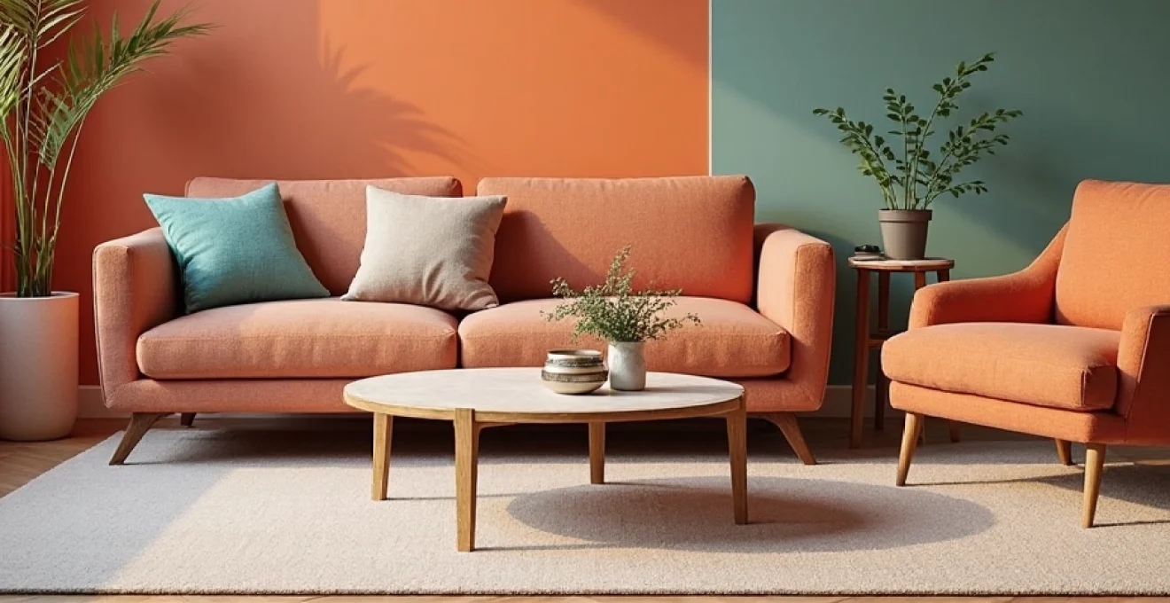
Warm hues: energizing interiors with terracotta and amber
Warm colors like terracotta and amber are known for their ability to create a sense of comfort and stimulate conversation. These earthy tones remind us of sunsets and autumn leaves, evoking feelings of warmth and coziness. In interior design, they’re being used to create inviting living spaces that encourage social interaction and relaxation.
Incorporating warm hues in gathering areas can significantly enhance the perceived temperature of a space, making it feel more intimate and welcoming.
Designers are pairing these warm tones with natural materials like wood and leather to create rich, textured environments that appeal to multiple senses. The result is a harmonious blend of color and texture that transforms ordinary rooms into captivating retreats.
Cool tones: calming spaces with sage green and powder blue
On the opposite end of the spectrum, cool tones like sage green and powder blue are prized for their calming properties. These colors are reminiscent of nature’s most serene elements—tranquil waters and lush forests. In interior spaces, they’re being used to create peaceful sanctuaries that promote relaxation and mental clarity.
The versatility of these cool hues allows for their application in various settings, from bedrooms to home offices. When combined with soft, natural lighting, they can significantly reduce stress and improve focus. Designers are increasingly turning to these colors to address the growing demand for wellness-oriented spaces in both residential and commercial environments.
Neutral palettes: balancing act with taupe and ecru
Neutral colors like taupe and ecru continue to play a crucial role in both fashion and interior design. These sophisticated hues serve as the perfect canvas for more vibrant accents or can stand alone to create a sense of understated elegance. The beauty of neutrals lies in their ability to adapt to changing trends while maintaining a timeless appeal.
In fashion, neutral palettes are being embraced for their versatility and ease of styling. They allow for the creation of capsule wardrobes that are both chic and practical. In interiors, neutral backgrounds provide a sense of spaciousness and calm, making them ideal for small apartments or busy family homes.
Color blocking: strategic use of vibrant accents
Color blocking has emerged as a powerful technique in both fashion and interior design. This approach involves using contrasting colors in bold, geometric arrangements to create visual interest and define spaces. In interiors, color blocking can be used to highlight architectural features or create focal points within a room.
Designers are experimenting with unexpected color combinations, pushing the boundaries of traditional color theory. For example, pairing electric blue with burnt orange creates a striking contrast that commands attention. This technique allows for personal expression and can dramatically alter the perception of space and form.
Sustainable pigments: eco-friendly color production
As sustainability becomes an increasingly important consideration in all aspects of design, the production of pigments and dyes is undergoing a significant transformation. The industry is shifting towards more environmentally friendly practices, developing innovative solutions that reduce the ecological footprint of color production.
Natural dyes: indigo, madder root, and cochineal
There’s a resurgence of interest in natural dyes derived from plants and insects. Indigo, extracted from the leaves of various plants, produces a range of blue hues. Madder root yields warm reds and pinks, while cochineal insects provide vibrant scarlet tones. These natural alternatives not only offer unique color variations but also significantly reduce the use of harmful chemicals in the dyeing process.
Artisans and small-scale producers are at the forefront of this movement, creating textiles and products that showcase the beauty of natural pigments. The slight variations and imperfections inherent in natural dyes add character and uniqueness to each item, appealing to consumers seeking authenticity and sustainability in their purchases.
Biodegradable colorants: innovations in textile dyeing
The textile industry, long criticized for its environmental impact, is embracing biodegradable colorants as a solution to reduce pollution. These innovative dyes break down naturally at the end of a product’s lifecycle, minimizing their long-term environmental impact. Researchers are developing new formulations that not only meet eco-friendly standards but also provide the vibrant, long-lasting colors demanded by consumers.
Major fashion brands are incorporating these biodegradable dyes into their production processes, demonstrating a commitment to sustainability without compromising on style. This shift is not only improving the industry’s environmental profile but also meeting the growing consumer demand for responsibly produced clothing.
Low-impact synthetic pigments: reducing environmental footprint
For applications where natural or biodegradable options are not feasible, low-impact synthetic pigments offer a more sustainable alternative to traditional synthetic dyes. These pigments are designed to require less water and energy in their production and application, significantly reducing the overall environmental footprint of color production.
The development of these pigments involves advanced chemical engineering to create molecules that adhere more efficiently to fabrics and surfaces. This improved efficiency translates to less waste and lower resource consumption throughout the coloring process. As these technologies continue to evolve, they promise to revolutionize color production across various industries.
Digital color matching: technology in trend forecasting
The intersection of technology and color has given rise to sophisticated digital color matching systems. These tools are revolutionizing the way designers and manufacturers approach color selection and application. By utilizing advanced algorithms and spectrophotometry, these systems can accurately identify and replicate colors with unprecedented precision.
One of the most significant advantages of digital color matching is its ability to streamline the production process. Designers can now easily communicate exact color specifications to manufacturers, ensuring consistency across different materials and production runs. This technology is particularly valuable in industries where color accuracy is crucial, such as automotive design and high-end fashion.
Moreover, digital color matching is enhancing the trend forecasting process. By analyzing vast amounts of data from social media, fashion shows, and consumer behavior, AI-powered systems can predict color trends with remarkable accuracy. This allows brands to stay ahead of the curve, developing products that resonate with consumer preferences before they even hit the mainstream.
Cultural influences on seasonal color palettes
Color preferences are deeply rooted in cultural contexts, and as global connectivity increases, we’re seeing a rich cross-pollination of color influences from various cultures. This cultural exchange is breathing new life into seasonal color palettes, introducing hues and combinations that challenge traditional Western color norms.
Wabi-sabi aesthetics: embracing imperfection in muted tones
The Japanese concept of wabi-sabi, which finds beauty in imperfection and transience, is influencing color choices in both fashion and interior design. This aesthetic favors muted, earthy tones that evoke a sense of calm and authenticity. Colors like charcoal grey, dusty rose, and clay brown are being used to create environments that feel grounded and serene.
Designers are incorporating these wabi-sabi-inspired hues into textiles with natural textures and finishes that celebrate imperfections. The result is a lived-in, yet refined aesthetic that counters the perfectionism often associated with modern design.
Scandinavian minimalism: light and airy color schemes
The enduring popularity of Scandinavian design continues to influence color trends, particularly in interior spaces. This style is characterized by light, airy color schemes that maximize natural light and create a sense of spaciousness. Pale neutrals like soft white, light grey, and beige form the foundation of this aesthetic, often accented with subtle pops of color.
The Scandinavian approach to color is not just about aesthetics; it’s rooted in the region’s long, dark winters and the need to create bright, uplifting interiors. This philosophy resonates globally, especially in urban environments where maximizing light and space is a priority.
Bollywood brights: vibrant hues inspired by indian cinema
The vibrant colors associated with Bollywood cinema are making their way into global fashion and design trends. These bold, saturated hues like saffron yellow, fuchsia pink, and peacock blue are being embraced for their energy and joy-inducing qualities. In fashion, these colors are appearing in both traditional and contemporary silhouettes, adding a touch of drama to everyday wear.
Interior designers are incorporating Bollywood-inspired colors through statement pieces and accent walls, creating focal points that enliven neutral spaces. This trend reflects a broader shift towards more expressive and personalized design choices.
African art: rich earthy tones and bold patterns
The rich artistic traditions of Africa are providing inspiration for color palettes that celebrate the continent’s diverse cultures. Earthy tones like terracotta, ochre, and deep brown are being paired with vibrant accents inspired by traditional African textiles and art. These color combinations offer a sophisticated alternative to more typical Western palettes.
In interior design, African-inspired colors are being used to create warm, inviting spaces that feel both grounded and exotic. The incorporation of bold patterns and textures alongside these colors adds depth and visual interest to rooms.
Color application techniques for maximum visual impact
The way color is applied can be just as important as the choice of color itself. Innovative application techniques are allowing designers to create unique visual effects that enhance the impact of color in both fashion and interiors.
Ombré effects: gradual color transitions in fabrics and walls
Ombré, the gradual blending of one color hue to another, continues to be a popular technique in both fashion and interior design. This effect creates a sense of movement and depth, adding visual interest to otherwise plain surfaces. In fabrics, ombré can be achieved through dyeing techniques or digital printing, resulting in garments that appear to shift in color as they move.
In interior design, ombré effects are being applied to walls to create dramatic backdrops or to simulate natural phenomena like sunsets. This technique can make spaces feel larger and more dynamic, especially when used with complementary colors.
Colorwashing: subtle layering for depth and dimension
Colorwashing is a painting technique that involves applying thin, translucent layers of color to create a soft, weathered look. This method is particularly effective in interior spaces, where it can add warmth and character to walls. The layered application of slightly different shades creates subtle variations in tone that catch the light in interesting ways.
Colorwashing can transform flat, monotonous walls into surfaces with depth and personality, mimicking the patina of age and wear found in historic buildings.
This technique is especially popular in rustic or Mediterranean-inspired interiors, where it complements natural materials like stone and wood. The softness of colorwashed walls provides an excellent backdrop for both minimalist and eclectic decor styles.
Accent piping: precise color definition in upholstery
Accent piping is a tailoring technique that involves adding a narrow strip of contrasting fabric to the seams of upholstered furniture or clothing. This method allows for precise color definition and can dramatically alter the perception of a piece’s shape and structure. In furniture design, accent piping is being used to highlight the contours of chairs and sofas, adding a pop of color that defines edges and creates visual interest.
Fashion designers are applying this technique to garments, using contrasting piping to create bold geometric patterns or to emphasize the cut of a piece. The result is clothing that feels both classic and contemporary, with clean lines that draw the eye.
These innovative color application techniques demonstrate the evolving nature of design and the endless possibilities for creative expression through color. By mastering these methods, designers and homeowners alike can create spaces and products that are not only visually striking but also deeply personal and emotionally resonant.